Keeping Your Colors Consistent

Color is an incredibly important facet of all of our lives. It is a tool of communication that can influence mood, convey rapidly digested ideas, incite physiological reactions, and, most importantly, make or break a design. You've probably heard the terms RGB, HEX, and CMYK floating around, but knowing their intricacies only further complicates the matter. Seeing that it is such a powerful tool, it should be no surprise to hear that it is rather difficult to master.
Color is not static; it’s constantly influenced by the world around it. Even though a certain red might appear one way on your phone, this doesn't mean it will look the same on your laptop or just a printed piece of paper. Color properties change from the slightest interferences from light, texture, and even just how one color appears to look when placed next to another. This makes it difficult to pinpoint a single color across a multitude of mediums.
When it comes to design, color is an entire subject in and of itself. For now, we’ll just focus on how to keep your color values consistent.
What You Need to Know
To keep colors consistent across every possible medium, there are 4 color modes that represent and tweak color across applications:

RGB
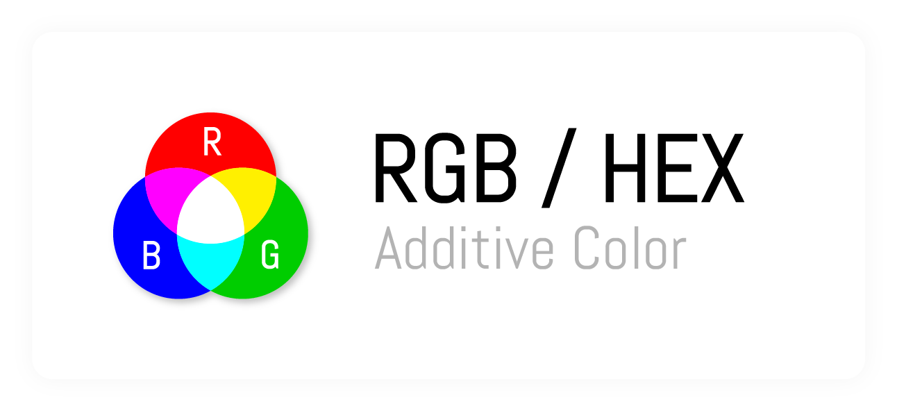
Whether you’re a designer or not, you’ve most likely heard of RGB. When colors are displayed on a screen, they are rendered using reds, greens, and blues. The screen you’re looking at consists of thousands of pixels, each currently displaying a red, green, or blue color value. These three colors are added together in varying amounts to create every other color in the color wheel, making RGB an additive color system.
As far as design goes, RGB color values are used when rendering color on anything with a screen. Seeing that all screens are backlit, RGB is the simplest way to display colors accurately across different devices. Bear in mind, that the colors will still be represented differently depending on the individual color settings on a given device.
HEX

HEX, short for hexadecimal, is used primarily in web design. It consists of a six-digit combination of letters and numbers that represent different color values for red, green, and blue respectively. Consider it to be the shorthand version of RGB that is specifically used for web design.

CMYK
Unlike RGB and HEX, CMYK is not used for on-screen purposes—it’s used for print. As mentioned previously, color is influenced by the world around it. Because of this, colors represented by CMYK take into account the lack of constant light on printed materials.
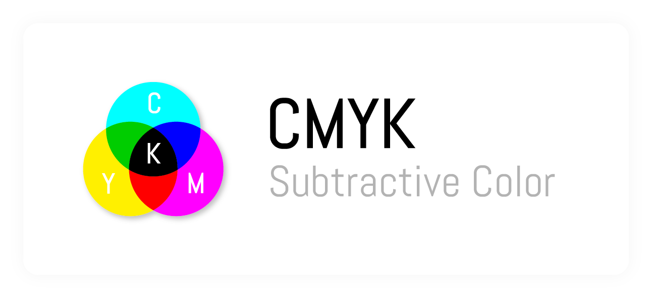
CMYK uses the colors cyan, magenta, yellow, and black (referred to as ‘key’) to create the spectrum of colors. Rather than have the colors created through individual pixels sitting side by side, like RGB, CMYK creates colors by overlapping tiny dots of color to create the correct value during the printing process.
To account for the lighting conditions of printed material, CMYK is a subtractive color system. This means that the color values you see are created by removing colors, rather than adding them together like RGB. Doing so allows the colors on printed material to absorb more light since there’s less ink present on the finished product—this little difference is what makes professionally printed pictures look drastically different than those printed in your home office (using RGB color values).
In short, don’t take color modes and their applications for granted.

Pantone
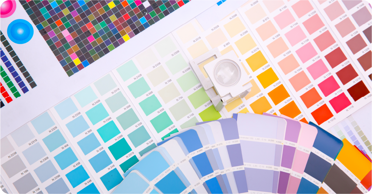
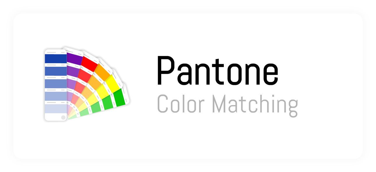
The Rosetta Stone of color in the design. Pantone is the near-universal method of communicating proper print colors between designers and printers. Having been around since 1962, Pantone has established what they call the Pantone Matching System. This proprietary system standardizes colors for reproduction in print, allowing designers and printers to effortlessly communicate accurate colors for any print job.
Most notably, they offer guides that essentially translate and facilitate color communication in a professional landscape. Their Formula Guide is considered to be the worldwide standard for choosing and matching colors, allowing designers and printers a streamlined method of picking and choosing the right colors for the job. Once the colors are chosen, the designers and printers can refer to the Color Bridge Guide. The Pantone Color Bridge Guide uses physical color swatches to help translate print colors and tones to RGB, HTML (HEX), and CMYK to ensure consistency throughout the entire design process.
Consistency is Key
Knowing the ins and outs of proper color representation allows for clean color consistency across your entire brand. Color consistency is key when it comes to increasing and maintaining your brand’s perceived value—something imperative for growth.
Luckily, Alopex can help. We do design, and we’re good at what we do. Our designers can keep the colors straight for you; they prep any design for any medium. From rack cards and vinyl stickers to physical packaging and web ads, your colors can be perfect. All you have to do is give us a call or reach out.