


What Makes a Great Alaska Tourism Website and the Mistakes to Avoid
Most visitors aren’t casually browsing your site. They’re planning a long-anticipated trip to Alaska and want answers fast. What do you offer? How much does it cost? Can they book it now?
If your homepage doesn’t answer those questions immediately, you're probably losing business.
Our team at Alopex Interaction Design reviewed a range of Alaska tourism websites to see how well they communicate, convert, and reflect the brands behind them.
First Impressions Count More Than Ever
Your homepage needs to do two things very well: tell visitors what you offer and help them take action. That starts with:
- A strong explanation of your adventure or tour
- Visual identity that’s easy to recognize and remember
- A call-to-action button that’s obvious and accessible
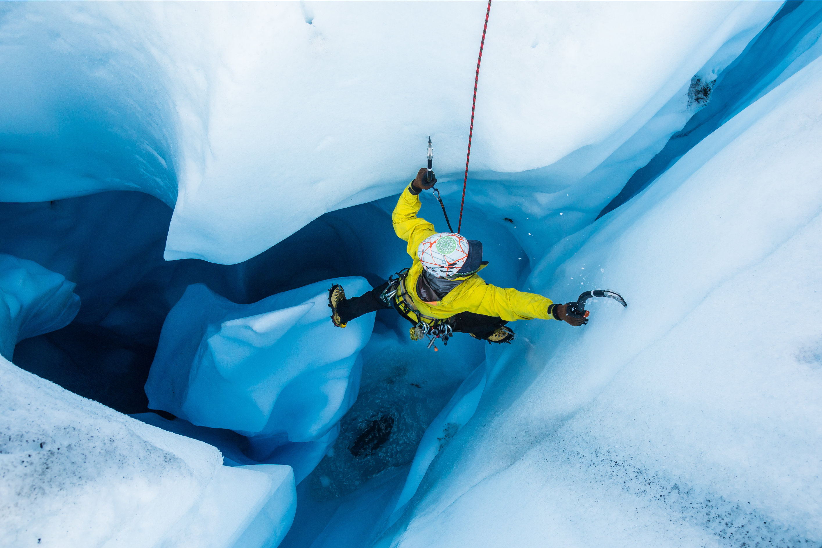
Websites that do this well lead with compelling imagery, highlight their most popular services, and make it effortless to take the next step. On the other hand, if your booking button is hard to find, if your photos are dull or repetitive, or if your message takes too long to get across, users will likely move on.
Tourism Branding in Alaska Often Misses the Mark
Many companies fall back on familiar Alaska visuals like mountains, wildlife, or the state outline. While these feel regionally relevant, they don’t help a business stand apart.
Strong branding should reflect how your experience feels. Is it rugged? Luxurious? Serene? Adventurous? Choose a clear direction and build around that idea.
Logos should be versatile and recognizable even at small sizes. Color palettes should reinforce your identity and stand out from the crowd. And your overall design should feel consistent across your website, print materials, and signage.
When in doubt, keep it simple, distinct, and memorable.
Layout and Visual Mistakes That Drive People Away
Even strong branding can’t overcome a confusing layout. When a site feels clunky or poorly styled, users lose trust and interest.
Poor Readability Hurts Trust
Text that blends into busy photo backgrounds or lacks contrast can make your content hard to read. If visitors struggle to scan your site, they’re more likely to leave than dig for answers.
Weak Buttons Lead to Missed Bookings
Passive calls-to-action like “Learn More” don’t create urgency. Replace them with clear, confident language like “Book Now” or “Start Your Adventure.” Buttons should stand out visually and guide users toward the next step.
Inconsistent Visuals Disrupt Flow
Icons, images, and layouts should feel intentional. Mismatched graphics, uneven image sizes, or overused stock photos make the site feel disorganized. A clean, consistent design builds trust and makes navigation smoother.
Reviews Should Be Easy to Spot
Travelers rely on reviews, especially for remote or unfamiliar destinations. But even glowing testimonials won’t help if no one sees them.
Make sure your top ratings from TripAdvisor, Google, or other platforms are placed high on the page. Use visual cues people instantly recognize, like yellow stars or platform logos. Let your happy customers build trust for you.
Easy Fixes to Improve Your Alaska Tourism Website
You don’t always need a full redesign. A handful of smart, targeted tweaks can make a big difference in how your site feels and functions:
- Place the “Book Now” button in a spot that’s easy to find
- Make sure text is easy to read and your content flows clearly
- Show real people enjoying your tours, not just pretty landscapes
- Keep your navigation simple and easy to follow
- Swap out generic icons for visuals that actually fit your brand
These tweaks help your site feel more authentic, more trustworthy, and more likely to turn a visitor into a customer.
Design isn’t about whether we can do it. It’s about why we’re doing it.
Your Website Should Be Doing the Selling for You
Alaska tourism sells itself in many ways, but your website still needs to make the case. That means reducing friction, offering shortcuts, and helping users quickly find the information they care about most.
The length of your page isn’t the issue. What matters is how well it's structured. Lead with your strongest visuals and clearest offers, then provide more depth for users who need convincing.
Avoid forcing users to bounce between too many subpages. Most prefer to scroll, as long as the content is relevant and easy to follow. You want people to be engaged enough to find the information they need. Use expandable sections to manage long content, repeat key booking prompts, and always make it easy to take the next step.
Why Leading Tourism Brands Choose Alopex for Website Design
Some agencies start with, “What can we do?” We start with, “What’s the right thing to do for this business?”
That level of intention guides every decision we make. We don’t design based on trends or templates, and we don’t just use techniques because we know how. Every decision (layout, colors, typography, button placement) has a purpose. We ask why before we ask how.
If you're ready to work with a team that thinks deeply, cares about the details, and builds with purpose, we’re here to help.
Let’s turn your ideas into something powerful. Contact us today to start the conversation.