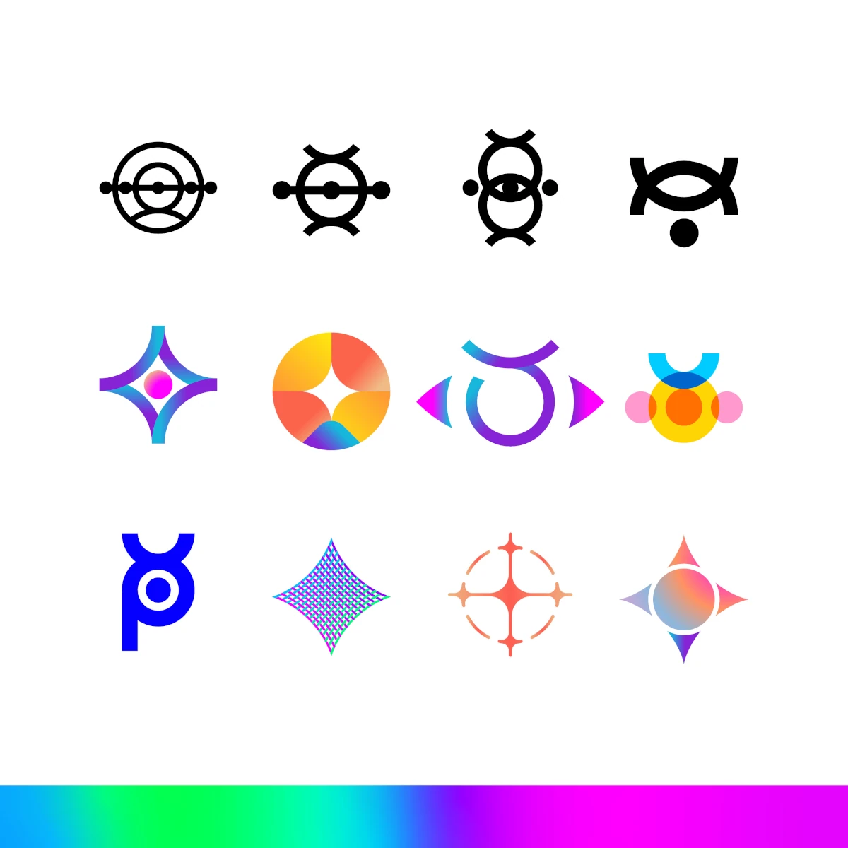
A Brand Built Outside the Lines
Some branding projects ask for refinement. Others ask for reinvention.
Parhelia Adventure Media asked for something rarer.
From the start, it was clear this would not be a conventional engagement. Parhelia did not want a logo that fit neatly into an existing category or echoed familiar visual language from the outdoor or media space. They wanted an identity that felt bold, cinematic, and distinct.
The request centered on energy and contrast. The challenge was translating that instinct into a direction that could remain expressive over time.
Defining a Direction Without a Template
Parhelia came to Alopex looking for a brand that would stand apart from predictable visual conventions. They described the desired energy as “sparkly pink and rainbows,” pointing toward light, motion, and intensity. The task was shaping that vision into a system that could be used confidently across real-world media applications.
1. Avoiding Literal Interpretation
The name references a parhelion, or sun dog, a rare optical phenomenon where light splits into radiant, geometric planes. Capturing that effect meant designing around the movement and structure of light, rather than illustrating the phenomenon itself. A literal interpretation would have limited how the identity could evolve.
2. Applying Restraint Without Dulling Energy
Early exploration tested bold color and expressive form. Some concepts introduced instability across applications. Others reduced the character Parhelia wanted to preserve. The final direction balanced visual intensity with structural clarity.
3. Designing Beyond a Static Mark
Parhelia required an identity designed for use across digital media, motion graphics, and print. The result was a brand system built to move, adapt, and remain recognizable across formats.
Where Structure Meets Motion
The Parhelia Adventure Media identity is built as a coordinated system, not a single logo. Geometry, color, logo variations, and typography form a unified visual language that supports expansion while maintaining consistency across applications.
The Value of Designing With Intention
Parhelia demonstrates how clear decision-making can guide complex creative work. Each choice narrowed the field without reducing ambition, allowing the brand to develop with focus rather than drift.
That clarity shaped an identity grounded in purpose, giving Parhelia a foundation that supports future growth without requiring reinvention.
Built for Brands Ready to Stand Apart
Parhelia Adventure Media invested in an identity designed for long-term use across varied contexts. The result is a brand that communicates direction clearly and holds together wherever it appears.
If you’re looking for a quick logo, Alopex may not be the right fit. If you want a brand shaped through exploration, discipline, and concept-driven thinking, that’s where we do our best work.
Let’s build something remarkable.
Services: Brand Design


